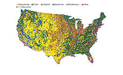
How America Uses Its Land
A series of interactive maps illustrating how land is used in America.

A series of interactive maps illustrating how land is used in America.
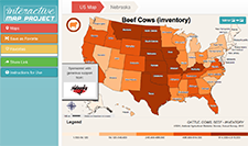
Use this interactive map to help students see how geography and climate affects the production of agricultural crops. The map has USDA statistics built in to allow your students to answer questions such as, "Which state(s) produce the most cattle?" "Where does [my state] rank nationally in corn production?" "What region of the United States produces the most cotton?" etc. There are many agricultural maps available including field crops such as corn, wheat, barley, and alfalfa in addition to fruit and vegetable crops, ornamental nursery crops, and livestock.
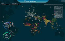
The World Food Programme (WFP) Live Hunger Map monitors food security in more than 90 countries and issues predictions where data is limited. The live map aims to identify areas that are currently food insecure or are sliding towards food insecurity. A static hunger map can be found if you click on "undernourishment" at the bottom of the page. It includes data from 2017-2019.

Maps that show the historical origins of major agricultural crops before they were domesticated across the globe as well as graphics representing current global producers of common commodities.
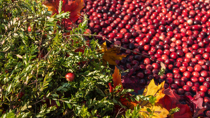
Do you know where each of these Turkey Day staples are grown? Navigate through eight maps illustrating the geography of where cranberries, turkeys, sweet potatoes, potatoes, green beans, brussels sprouts, pumpkins, and pecans are grown.
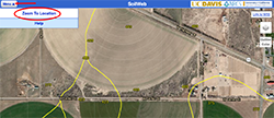
This interactive map allows you to explore USDA-NCSS soil survey data for locations throughout most of the U.S. It is compatible with smartphones, tablets, and desktop computers. Zoom into an area of interest and discover the soil composition.
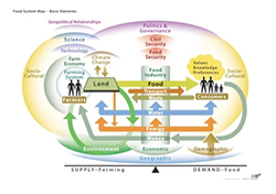
The global food system is balanced between the supply and demand of food and tethered to our environment. These high resolution PDFs demonstrate visually the complexity of agriculture. These maps highlight how the global food system is the balance between supply and demand of food as governed by geography and politics. These elements are divided into natural systems and human systems.
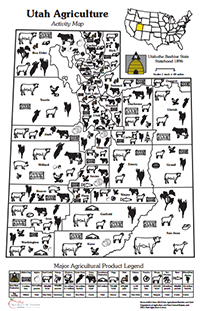
This engaging map shows agricultural production in Utah by county. Questions on the back help guide students to consider agricultural production in their home county and state. This map is available as a free download.
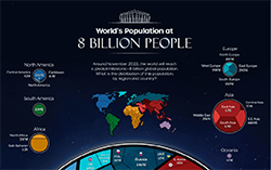
Around November 2022, the world will reach a pivotal milestone—8 billion global population. Use this infographic to visualize the distribution of the world's population by region and country.

Visit this website to see maps and graphs to discover where your Thanksgiving dinner foods such as green beans, carrots, celery, sweet corn, cranberries, onions, pecans, potatoes, pumpkins, squash, sweet potatoes, turkey, and wheat were produced.
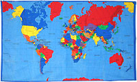
This fabric map is an excellent resource for "hands-on" geography activities. The cotton fabric washes well and can be taken outside. Countries and their capitals, and major bodies of water are identified. Each map has been serged around the edges. Order the map individually, or add on a set of Herbs and Spices Cards, Where in the World Food Cards, or Lunch Cards. Students will use the cards to identify where in the world each of the foods come from. Order this map online from agclassroomstore.com.
30-minute video segment giving an overview of how programs at the University of California are striving to meet the challenge of feeding an ever-growing global population with sustainable practices.